Introduction
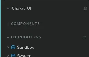
When I was using Chakra UI, I noticed the components were organized into folders like this, and I wanted to reproduce it.
However, searching Google for “Storybook folder organization” didn’t turn anything up, so I’ll write down the technique.
Finding the technique
This is probably something in the Storybook docs too, but when I looked at Chakra UI’s code, I found the following.
import { Box } from "../src"

export default {
  title: "WIP / Bar Chart",
  decorators: [
    (Story: any) => (
      <Box p="10">
        <Story />
      </Box>
    ),
  ],
}
It turns out you just set title to <folder name> / <component name>.
Trying it out
export default {
+  title: "Folder1 / Component1",
  component: Component1,
} satisfies Meta<T>;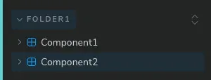
Done 🎉 It was really simple, wasn’t it.